Colour in the kitchen
Kitchen colour confidential
Since we were “burned” by the brash and bright colour palettes popularised in the ‘60s and ‘70s, modern kitchens have not been the most colourful spaces – often characterised by dull, neutral colour schemes. However, today, the trend is to bring “pops” of colour into the kitchen. Says Mercia de Jager from leading appliance manufacturer, Miele: “ The kitchen is the heart of any modern home, so why should it be heartless, cold and sterile?”
However, choosing from an infinite number of kitchen colour schemes can be a daunting task. To make things a little easier, Mercia offers some invaluable advice on how to successfully go about adding colour into your kitchen space, that will appeal to the entirely colour-phobic, to the colour committed.
Define your colour palette
The first thing you need to do is to determine the colour palette for your kitchen, says Mercia: “Decide on a dominant colour, which will take up the majority of your kitchen area, as well as your secondary colour, which will serve as an accent colour to complement your dominant colour choice. Of course, you can have more than two colours in your palette if you so desire. The dominant colour should be somewhat muted, while the secondary, tertiary and other accent colours, can be richer and brighter.”
Mercia provides the following tips to consider when developing your kitchen palette:
- Never use equal areas of contrasting colour: The majority of your kitchen should comprise neutral or lighter colours, while bright colours should be confined to accents.
- Too many dark tones can be oppressive: Always try to lift darker colour palettes with lighter hues, or alternatively, add some richness to lighter palettes with some luxuriant darker hues.
- Balance patterns and texture: An overabundance of textures and patterns can be overwhelming. Patterns and textures should be used in specific feature points to liven up an otherwise simple or staid colour scheme.
- Colour intensity: Make sure that you take into account that wall colour will reflect onto itself and intensify the shade. You can counteract this by opting for a lighter shade of the same colour, or by using a matt finish. The natural light in a room can also affect wall colour intensity – so before you choose a colour it is a wise idea to test it out in the actual room beforehand.
Create a colour scheme
The concept of colour harmony is based on an understanding of how to arrange colours into practical colour schemes. Mercia explains that there are five basic categories with regards to successful colour schemes:
- Monochromatic schemes: This palette comprises a single hue throughout, in various tints, shades and tones.
- Analogue colour schemes: This palette uses various colours, usually three, that are adjacent to one another on the colour wheel. One will be the dominant colour, while the other two are used as accent colours.
- Complementary colour schemes: By using contrasting colours that are directly opposite each another on the colour wheel, the chosen colours will appear more intense for a powerful visual impact. In kitchens, this kind of colour scheme will be toned down somewhat, reduced in amounts and varied in intensity to lessen the often harsh visual statement.
- Triad colour schemes: Choose any three tones that are equidistant on the colour wheel to achieve this kind of colour palette.
- Neutral colour schemes: The scheme is very simple, and can be created by using black, white, grey, cream, beige, stone or brown. This is a good colour scheme for very small spaces, as it tends to create the illusion added size.
Clever ways of adding colour to your kitchen
Aside from adding colour to your kitchen walls and window dressings, there are a number of other ways to bring colour into your kitchen design – Mercia outlines some of the top colour contenders:
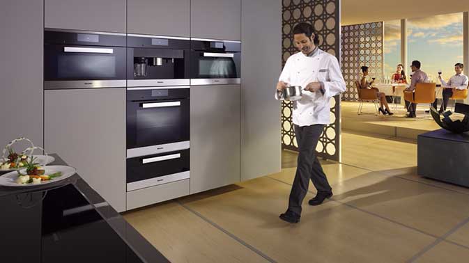
Cabinets: Kitchen cabinets take up a large majority of your kitchen’s visual space, and they are a great way of adding colour to the overall design. Mercia says that your kitchen cabinetry should be seamless, and not even the appliances should disturb the visual flow of their design: “The integration of appliances into the cabinetry is increasingly in demand, because customers want to create a clean, streamlined appearance in their kitchen space. The design of Miele’s Generation 6000 range of built-in appliances for example, has already been at the receiving end of numerous international design awards. One reason for these accolades is the way products, from widely differing product groups, harmonise perfectly with respect to form and function, appearing to come from the same mould – seamlessly blending with the cabinetry in which they are housed.”
Countertops, flooring and splashbacks: All three elements in the kitchen – the countertops, floor and the splashbacks – take up considerable visual space in your overall kitchen design, and can be segmented in order to add a “pop” of colour into the kitchen space. Remember however, that all three elements need to look good and harmonise with the rest of the décor, while still remaining functional; especially considering the kitchen is a high-traffic wet area – so choose your materials wisely.
Appliances: Your choice of appliances will make a big impact on the overall appearance and functionality of your kitchen, and they should complement its look and colour palette. Says Mercia: “In modern kitchens with an open transition to the living area, built-in appliances should ideally form part of the overall concept of the interior design. As such, it is no longer acceptable for appliances to be purely functional – they need to look good too. Colour has also a profound impact on the overall impression of a kitchen space, and Miele offers lovers of fine kitchens a range of four colour options – Obsidian Black, Havana Brown, Brilliant White and CleanSteel Stainless Steel.” She says that Miele has also introduced colour-coded cookerhoods to its range: “Customers can choose from an exceptionally wide range of colours from the RAL colour guide, to ensure that their cookerhoods adds to the overall colour scheme of their home.”
Lighting: Low commitment, high impact - lighting is a very versatile and “safe” way of adding some colour to your kitchen design. If you tire of the colour, you can simply switch the light off and give yourself a break. LED striplights are very easy to install, comparatively well priced and are a great source of ambient or under-counter lighting. Alternatively, for a more unobtrusive option, you can install Miele’s DA6290 W Lumen cookerhood, says Mercia: “This cookerhood boasts dramatic, colour-changing LED lights that can pass through 196 000 shades, which truly makes this wall-mounted hood an object of desire for many chefs, and a great source of colourful ambient light.”
Download as PDF